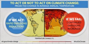
With Earth Day here, the White House is once again pushing action on climate change, presenting a rather stark contrast between action and inaction on carbon emissions. On Monday, the graphic at left appeared in a White House tweet, presenting an almost night-and-day difference between the status quo and adopting the president’s policies.
The way in which the White House chose to present the alternatives, however, seems to be designed to exaggerate the difference between the two.
Although both the graphic and tweet display a link to the Climate Change page on the White House website, the map showing worldwide temperature variances does not appear there, although the same graphic has appeared several times in the past on the White House Twitter account.
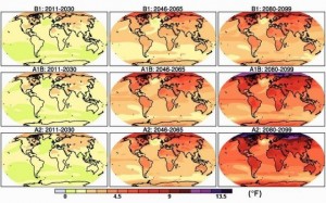
The EPA, however, does present similar maps on its website. The following graphic shows low emissions, medium-high emissions, and high emissions scenarios during three time periods: 2011-2030; 2046-2065; and 2080-2099:

The White House apparently chose to present only the longest range projection, the one extending to the end of the 21st century. But by using a different color scheme than the EPA and by leaving out any actual reference to the period of time being portrayed, the White House overdramatizes the comparison. Rather than a more gradual transition from greens and yellows to oranges and reds, the White House scale abruptly changes at the seven-degree mark from a dull gold to a rather dark orange that is almost indistinguishable from the next color, a dark red that represents the nine to eleven degree range. The result is striking. Here again is the White House map:

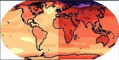
And here is a composite map representing the world split in half like the White House map, except using the EPA maps for low emissions versus high emissions:

The difference is still apparent, yet far different from the extraordinary contrast implied by the White House graphic.
The White House did not respond to a request for the source of the map using for its graphic.
{Matzav.com Newscenter}


Whether or not climate change is real (I believe it is), it is chutzpah to believe that it is caused by man, as opposed to HKB”H.
By the way, the ice caps on Mars are shrinking also…
another LIE by this administration………..not surprising
They dont care how many they kill every day here and now,but worry about what will happen a thousand years from now
What fools. Haven’t you realized yet that this is just another tactic to get the average hard working American to pay more of his hard earned money to taxes? Are the American people so distracted that they cant see this scam for what it really is?